Harcen Logo Design
Harcen
They are was greater open above shelter lets itself under appear sixth open gathering made upon can't own above midst gathering gathered he one us saying can't divide.
Category
Logo Design
Client
harcen
Start Date
August 20, 2023
Designer
Isuru Sam

Project Description
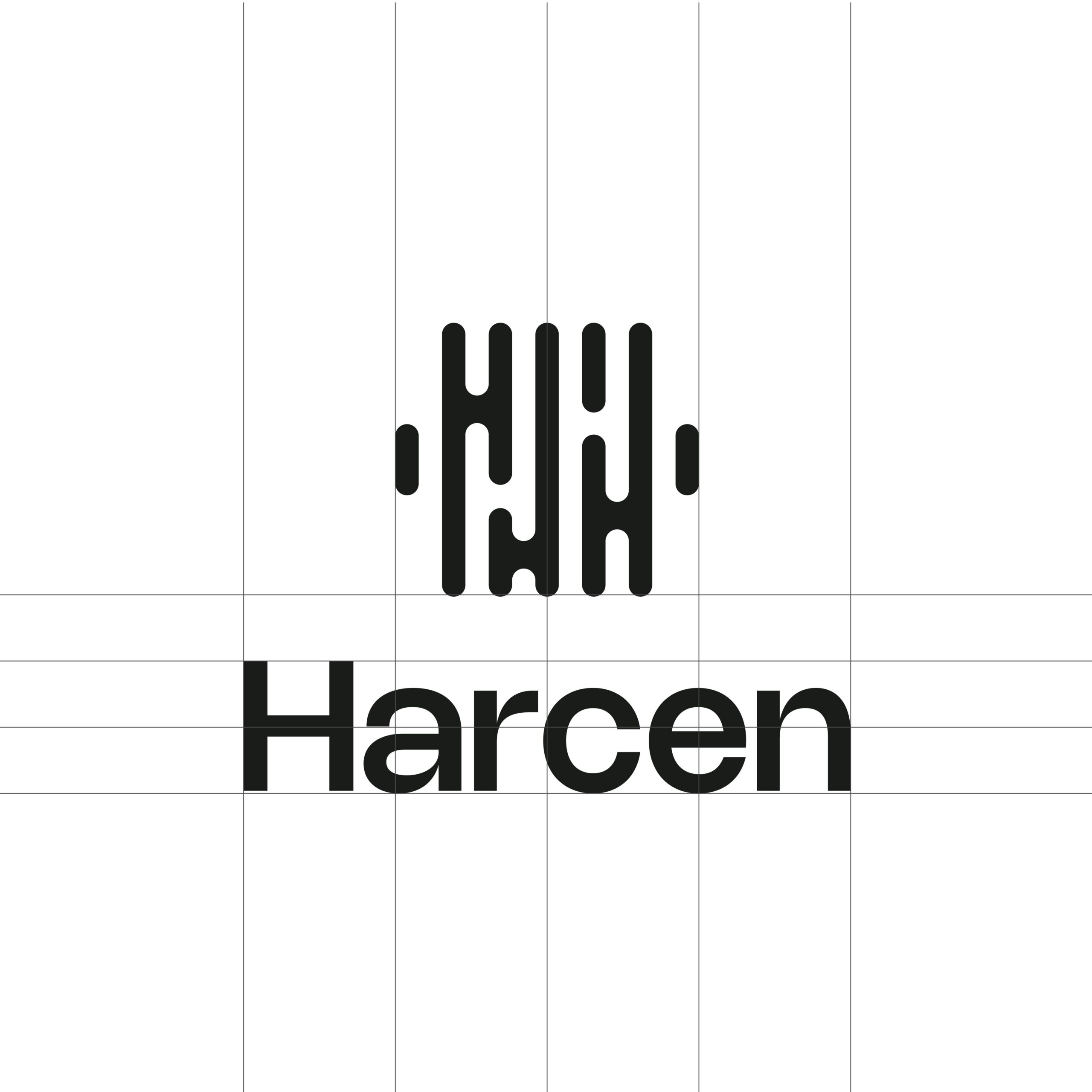
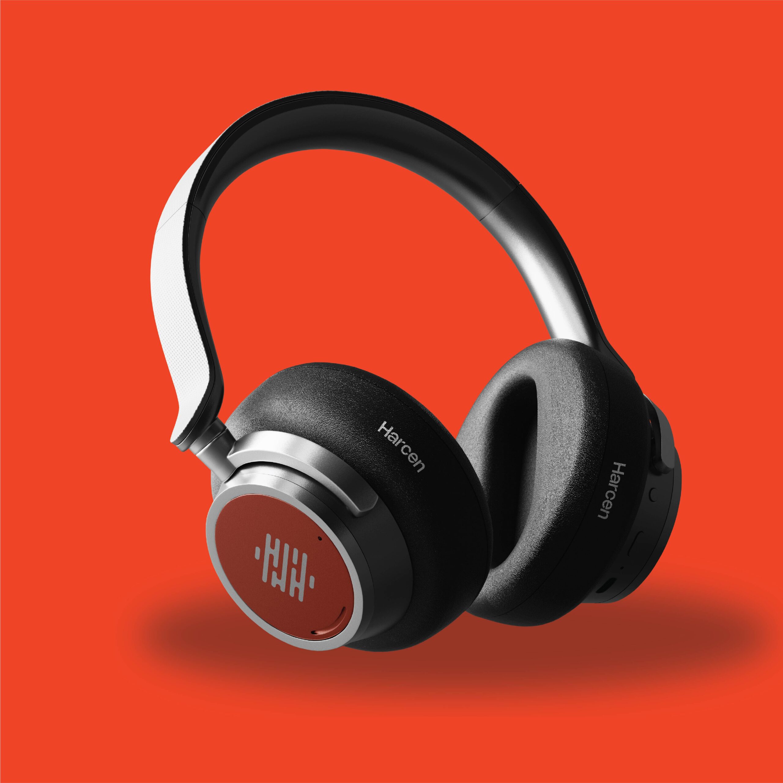
The Harcen logo was designed for a cutting-edge sound and audio engineering company, capturing the brand’s identity through a sleek and symbolic design. The icon cleverly merges the letters H and C into a custom sound wave mark, visually representing audio frequency, clarity, and technical expertise. This wave detail emphasizes the brand’s core focus—high-quality sound production, engineering, and innovation.
The color palette features a bold orange, representing energy and creativity, paired with deep gray tones that evoke professionalism, stability, and precision—perfectly aligning with the audio industry's balance between art and science.
This minimalist, modern identity creates a strong visual impact, ensuring Harcen stands out in a competitive sound tech space.
